
Texas Heart Institute ECRI website Redesign
Date
January–April 2026
Client
Texas Heart Institute — Electrophysiology Clinical Research & Innovations
Redesigned the website experience for Texas Heart Institute’s Electrophysiology Clinical Research & Innovations lab into a clearer research hub for researchers, funding organizations, and prospective interns
My role
I worked as a UI designer with a direct line to the client
My primary responsibility was designing the research-focused portion of the ECRI website. I explored how the lab could communicate its projects, publications, areas of expertise, and external recognition through an interface that was credible, visually engaging, and easy to scan.
Throughout the project, I also acted as the main communicator between our team and the client. I initiated contact, scheduled recurring meetings, prepared agendas and interview questions, presented our design work, requested missing content and branding materials, and documented the feedback that shaped each iteration.
Having direct access to the client gave me a more immediate understanding of their goals, preferences, and concerns. I could use their feedback when making decisions making my design work more responsive to both the lab’s identity and its practical needs.
The context
ECRI needed more than a visual refresh
The Electrophysiology Clinical Research & Innovations lab conducts cardiac-arrhythmia research, develops and evaluates medical technologies, collaborates with academic and industry partners, and publishes work within the electrophysiology field.
However, its existing web presence did not communicate the full breadth of that work.
The lab’s information was contained within the larger Texas Heart Institute website, making the ECRI page difficult to find through a general search. Searching for its principal investigator, Dr. Mehdi Razavi, did not clearly connect him to the lab. Publications were not presented in one accessible location, research projects lacked detail, and information about collaborators, funding, team members, and internships was fragmented or absent.
For a lab seeking research partnerships, grant funding, industry credibility, and new talent, the website needed to function as more than an informational page. It needed to become a central and credible record of the lab’s work.
During the initial client meeting, the client emphasized discoverability, publications, current projects, collaborators, funding recognition, and the connection between Dr. Razavi and the lab as major priorities.
The challenge
How might we organize and present ECRI’s research so visitors can quickly understand the lab’s work and find evidence of its impact?
The initial request was framed as a website redesign, but our early discussions revealed that the central problem was not simply visual inconsistency.
The lab had valuable research, publications, collaborations, and media coverage. The real difficulty was that these pieces did not feel connected. A visitor could not easily move from understanding the lab’s mission to exploring its projects, publications, researchers, or external impact.
The redesign therefore needed to accomplish three things:
01. Establish credibility
Grant reviewers, collaborators, and industry partners needed to quickly see evidence of active and substantive research.
02. Improve discoverability
Visitors needed clearer paths to projects, publications, team members, collaborators, and opportunities.
03. Improving Impact
The site had to support experienced researchers without becoming inaccessible to students or less technical visitors.
Understanding the existing experience
I began by auditing the site as a first-time visitor
I reviewed the broader Texas Heart Institute website and the ECRI page to understand how information was currently structured and where visitors were likely to encounter friction.
I identified several recurring UI problems:
Dense blocks of text with limited visual hierarchy
Low-contrast text
Buttons with inconsistent styles and unclear affordances
Research projects presented without enough context
Publications and external coverage that were difficult to locate
Layout and typography that changed across related pages
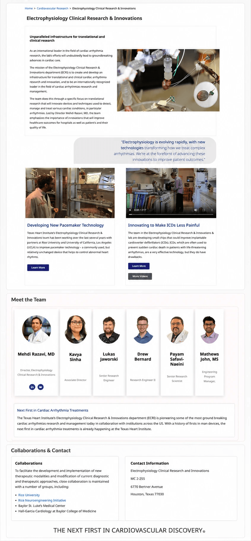
The page also included isolated content such as a quote positioned above research tabs without making its relationship to the surrounding information clear.
My audit of the original experience specifically noted overwhelming information density, nested menus, unexpected menu behavior, inconsistent buttons, poor text contrast, and confusing placement of ECRI content.
Looking beyond ECRI
I studied how established research organizations communicated complex work
Because we were unable to distribute our planned user survey due to privacy concerns and the limited project timeline, I supplemented the client interviews with a comparative website review.
I specifically examined the American Heart Association and UT Health, along with additional examples collected by the team, to understand how established medical and research organizations organized large amounts of information.
What I observed
The strongest examples did not depend entirely on long written explanations. Instead they used:
Clear sections to separate research areas
Diagrams and infographics to clearly communicate complex work
Dedicated spaces for research spotlights and recent news
Visual summaries of an organization’s mission and impact
UT Health was especially influential because it used cards, diagrams, and visual summaries to make technical research easier to scan. This led me to question whether ECRI could similarly communicate its impact through visual data.
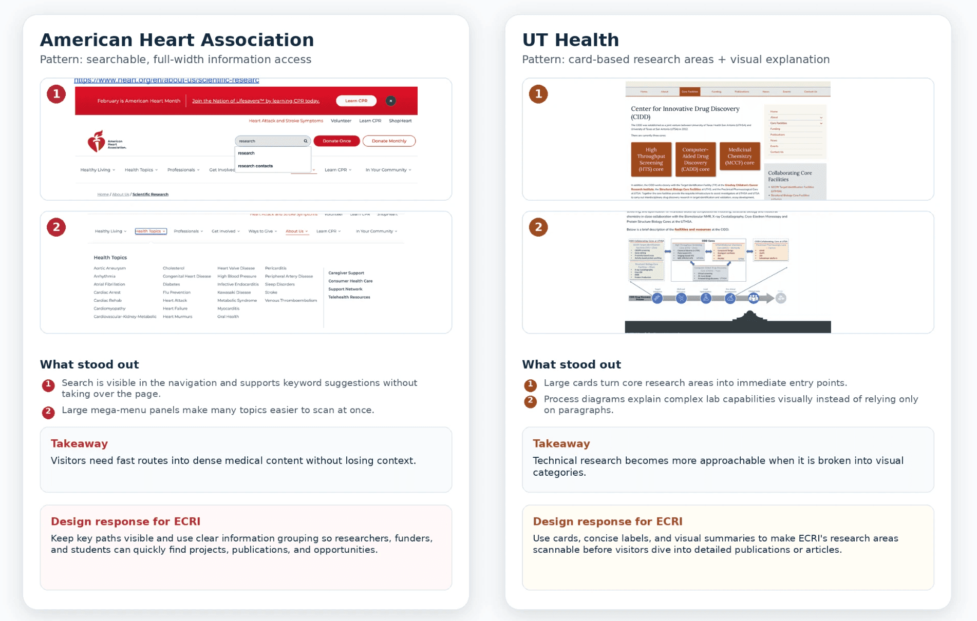
The comparative-research portion of the project documented card-based information grouping, research spotlights, infographics, accessible navigation, and visible search patterns across medical websites.
Restructuring the experience
Before designing screens, I reconsidered how the information should connect
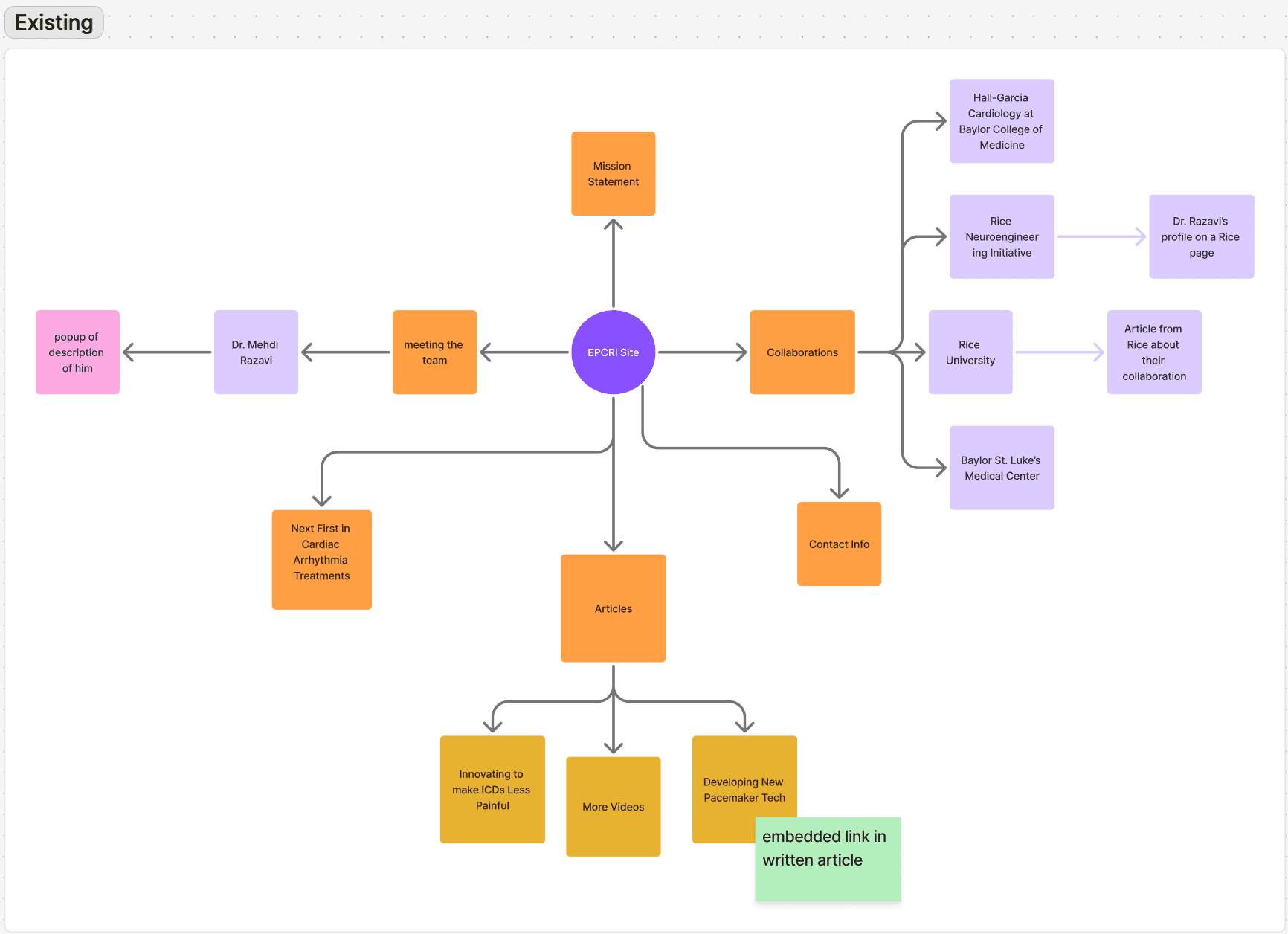
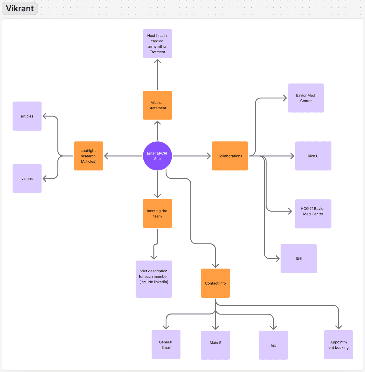
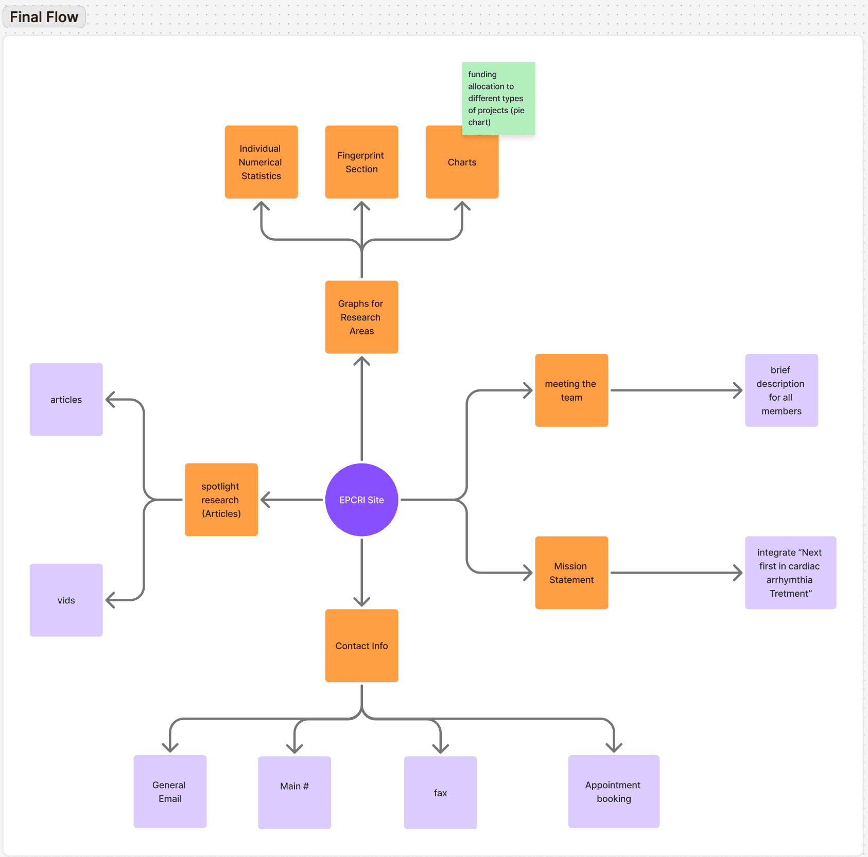
I independently created one proposed information architecture while a teammate developed another.
Rather than selecting one structure outright, we compared both approaches and morphed our strongest elements, while perseving parts of the existing site such that the redesign would not feel unfamiliar.
My proposed direction treated ECRI as a central hub connected to:
The lab’s mission
Current research
Research publications and media coverage
Dr. Razavi’s areas of expertise
Team members
Collaborators
Funding
Student opportunities
Contact information
The consolidated structure gave research a more central role while creating clearer paths between the lab, its people, and its outputs.
Moving from structure to interface
I contributed across the full page before focusing on the research experience
During low-fi and mid-fi prototyping, the team initially explored the complete page together. I contributed ideas to the landing experience, research-project presentation, and the relationship between the research, team, and contact sections.
As the design became more defined, we divided ownership for the high-fidelity experience. I became primarily responsible for the research section of the site.
This included:
The proposed research-impact visualization
Recent projects and news content
The “fingerprint” research taxonomy requested by the client
Spotlight research and publication presentation
Designing the research experience
1. My original concept: make the lab’s impact visible
During my comparative analysis, I noticed that many established medical and research websites used statistics and visualizations to communicate their scale and impact.
I decided to apply a similar pattern to ECRI.
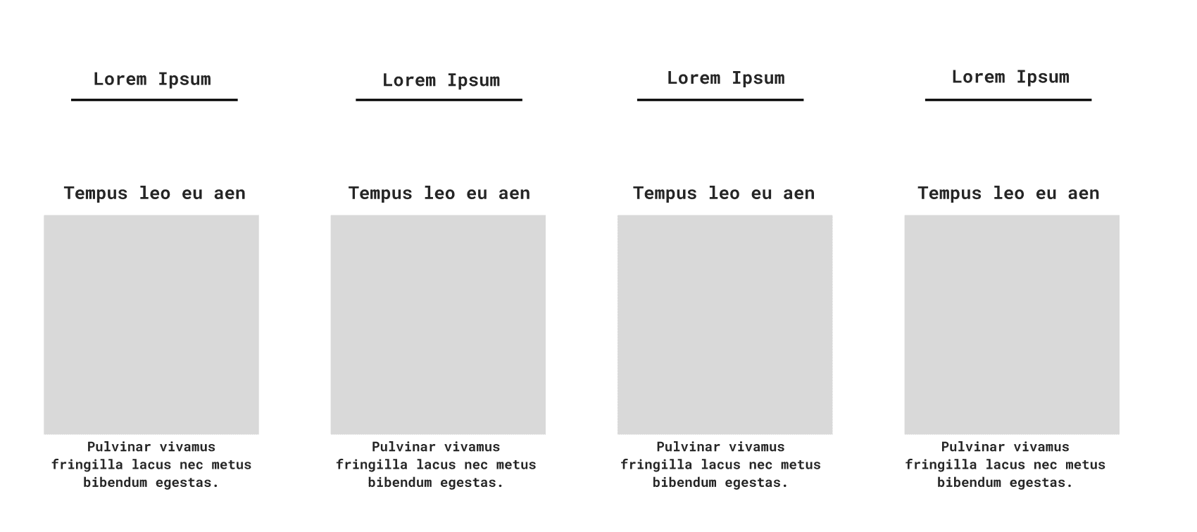
Original proposal that would showcase real numerical statistics as well as a graphical representation of the lab's impact/
My intention was to give grant reviewers, researchers, and partners an immediate understanding of the lab’s activity before asking them to read more detailed content.
My concept was rejected
When I presented the idea, the client did not agree. A major challenge that this idea presented was obtaining actual data from the lab. The client also emphasized that she wanted a more qualitative presentation and remained committed to using a “fingerprint” model to express the variety of reserach topics Dr. Razavi has worked on throughout his longstanding career. This created an important design constraint. The interface still needed an engaging and scannable way to demonstrate credibility, but I could no longer rely on statistics.
2. Reframing the rejected idea
Instead of defending the original solution, I returned to the underlying need
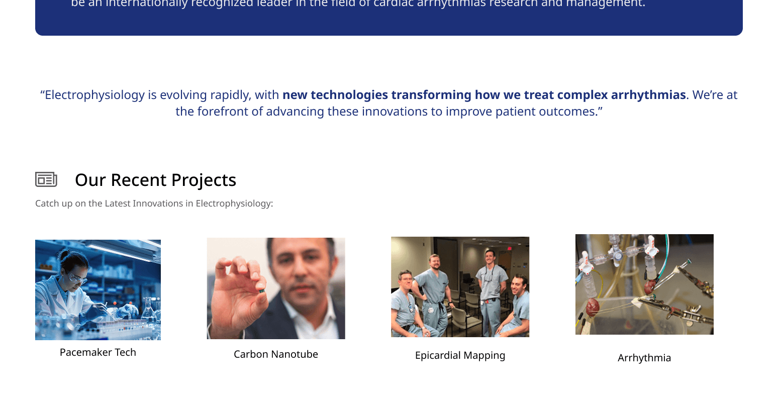
After further brainstorming, I recognized that ECRI already had areas that could be strengthened that still aligned with my proposed design layout like news articles, project announcements, and external coverage. The problem was that this information was difficult to access in the existing experience.Thus, I proposed repurposing the graph section into a dedicated area for news and research touchpoints.
This accomplished the original goal without forcing the lab into a data format it did not support:
External articles provided third-party evidence of ECRI’s work
Project updates kept the page current
Research categories made technical work easier to scan
Visitors could move from a high-level summary into deeper content
The lab gained a visible space to continually demonstrate activity
This became my most important contribution to the final design: turning a rejected interface concept into a solution that better reflected both the client’s identity and the available content.
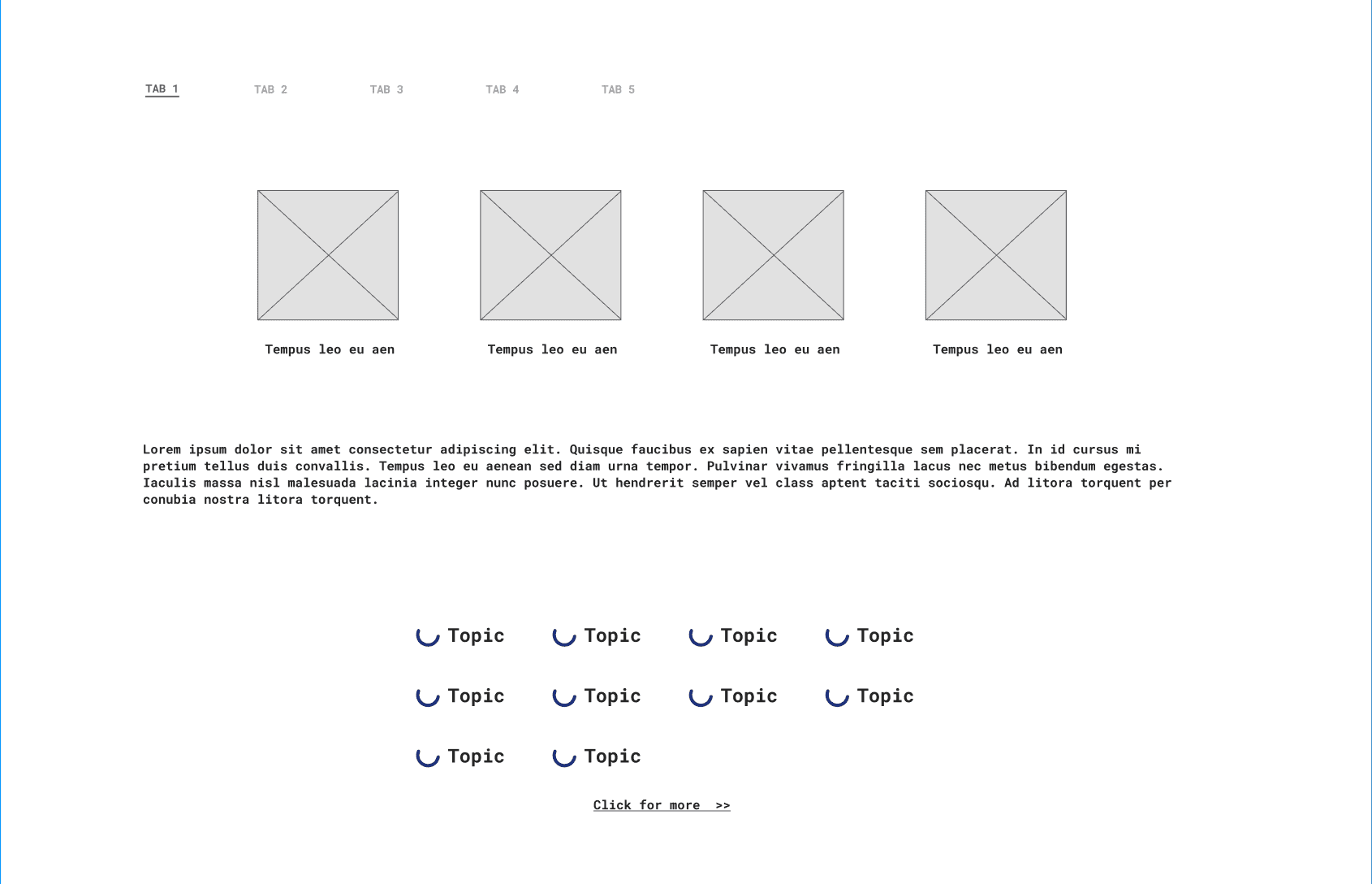
Final Mid-fi prototype that recycled the statistical and graphical layout that became a new section to showcasing impact more broadly including a subsection of news articles and the requested fingerprint section.
3. Making research easier to scan
To prevent the updated section from becoming another large collection of links, I organized content around the lab’s primary research areas.
This allowed visitors to begin with a recognizable topic and progressively explore related projects or articles. The structure supported both experienced researchers looking for specific work and less technical visitors trying to understand the lab at a high level.
I used cards and concise labels to create clear entry points instead of exposing every article at once.
Preserving the client’s fingerprint concept
The client wanted the site to show the breadth of Dr. Razavi’s work at a glance
The fingerprint was an abstract visualization intended to represent the range of topics Dr. Razavi had explored throughout his research career.
Although the concept originated with the client, I collaborated with my teammates to determine how it should behave within the wider page.
Each fingerprint connected:
A specific research topic
A broader medical field
Related publications or research coverage
Exploring the layout
We considered two primary arrangements:
A contained fingerprint area followed by separate spotlight research
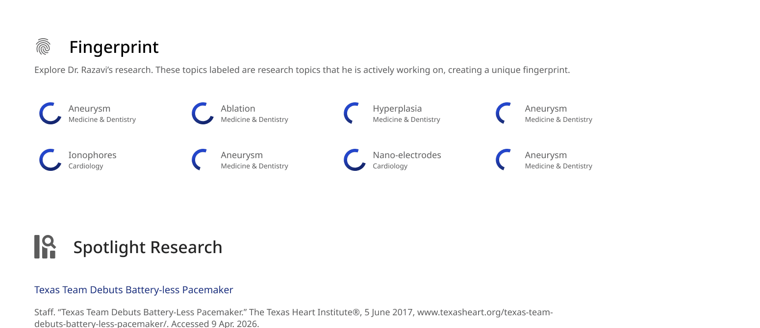
A wider fingerprint layout that also acted as a visual index for the content beneath it
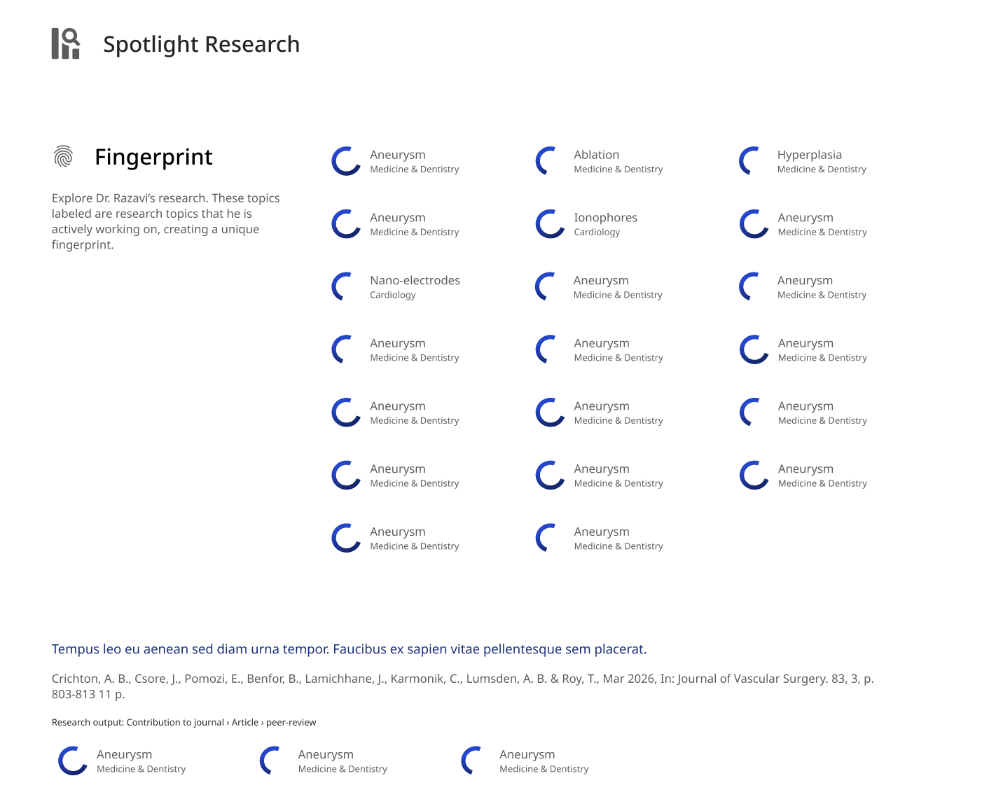
The wider layout gave each label more room, improved readability, and made the fingerprint section feel like a meaningful part of the experience rather than a decorative insert.
I also moved away from placing every item inside a bordered card. Removing the containers produced a lighter interface and allowed the spacing to reflect relationships between research areas.
Creating a research index
I borrowed familiar patterns from academic search tools
The existing website did not provide a clear, consolidated way to browse ECRI’s publications and research coverage.
For the spotlight-research area, I drew from patterns used by Google Scholar and Rice’s Fondren Library. Rather than presenting publications as generic cards, I helped structure each result around the information researchers expected to see:
Article or project title
Authors and publication details
A short description or output type
Relevant research fingerprints
A clear path into the full article
The fingerprints became more than an isolated visual. They functioned as recurring topic labels that helped visitors connect individual publications to the lab’s broader research areas.
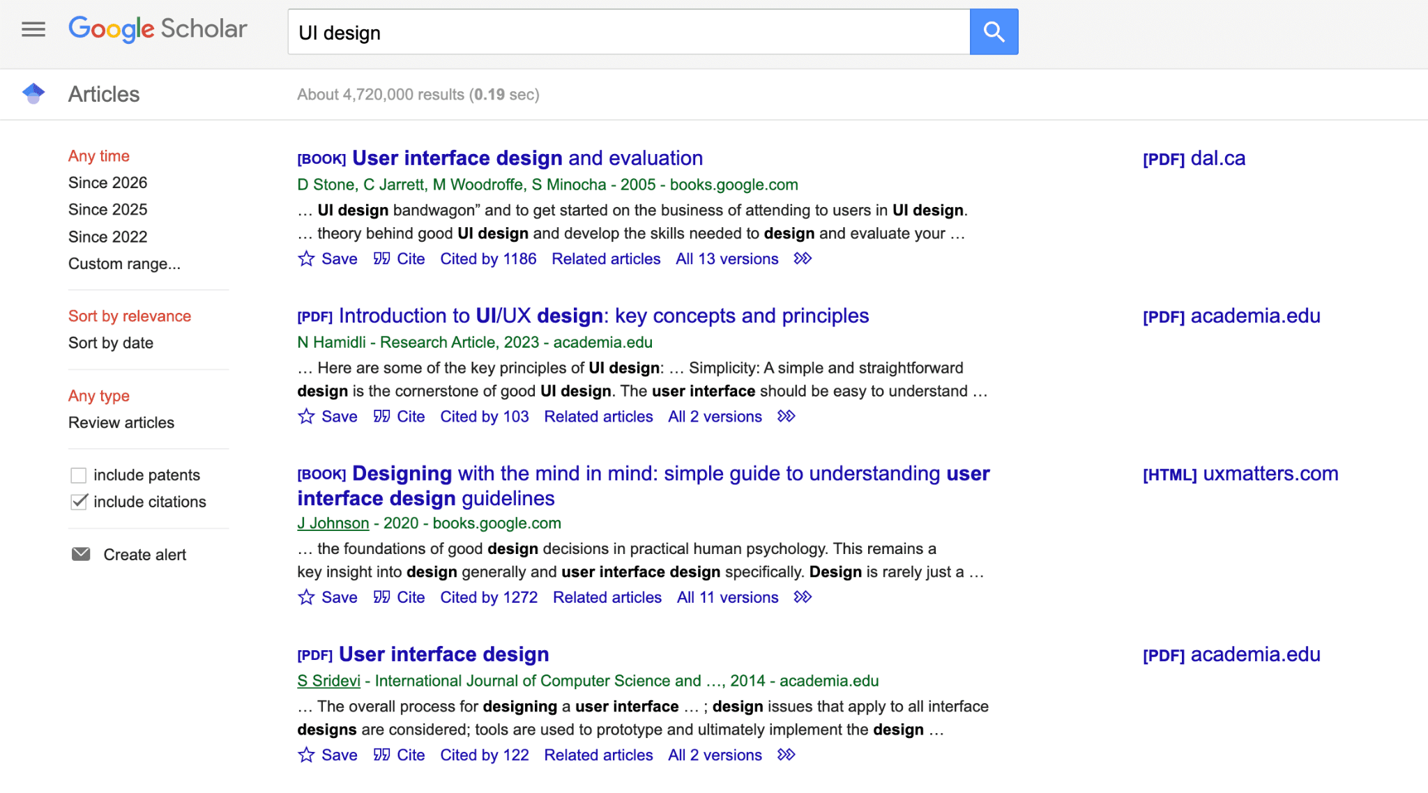
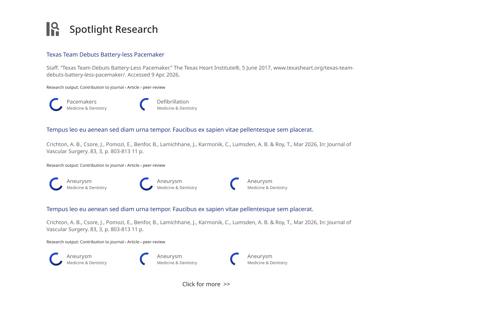
A direct comparison with Google scholar’s UI design
Building a cohesive visual system
ECRI did not have a dedicated design system to build from
The team needed to create a visual language that felt connected to Texas Heart Institute while giving ECRI a clearer and more contemporary identity.
I helped develop, critique, and apply the shared system across the screens I owned.
The system emphasized:
A restrained blue-and-white palette
Clear typographic hierarchy
Consistent spacing
Reusable cards and content patterns
Repeatable fingerprint and research-label components
A minimal visual style that kept attention on the research
Access to formal branding material was delayed, so we initially derived the interface from the visual cues available on the existing institutional website. Once the client provided additional direction, we refined and consistently applied the system across the final design.
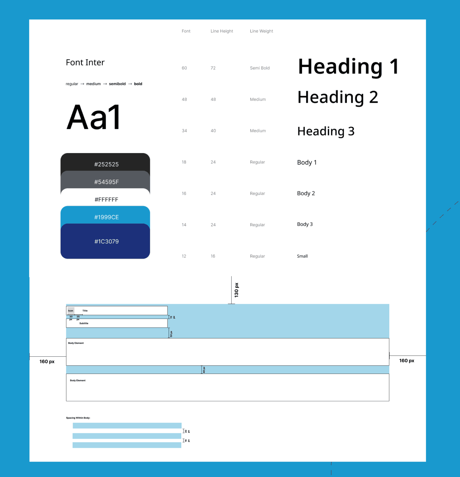
Design System presented during our final presentation
Outcome
The client approved the final direction
At the end of the three-month engagement, our team presented and handed off a high-fidelity website prototype.
In summary, the final design:
Created a more coherent relationship between ECRI, its researchers, and its output
Made projects and publications easier to browse
Gave external research coverage a dedicated and visible location
Preserved the client’s fingerprint concept while making it more understandable
Established a reusable visual system for future ECRI content
Reflection
Client communication became one of my most valuable UI design tools
This project changed how I think about the relationship between stakeholder communication and interface design.
Serving as the main communicator did not take me away from the design process. It strengthened my design work. Hearing the client’s motivations firsthand helped me distinguish between a requested feature and the underlying need behind it.
The graph concept demonstrated this most clearly. My first solution was visually compelling and supported by comparative research, but it did not accurately reflect how the client wanted the lab represented. Rather than treating that feedback as a simple rejection, I returned to the original objective and found another way to communicate impact.
I am most proud of transforming that constraint into the news and research-touchpoints experience. It preserved the value of the original idea while producing a solution that was more useful, more maintainable, and better aligned with the lab.