
Design-a-Thon 2025 - Burst Your Bubble
Date
Jan- 2025
Client
Burst Your Bubble, a mobile app concept that helps college students discover nearby experiences and turn them into memories
Starting with a broad prompt
“Staying human in the age of AI” could have meant almost anything
The prompt we were given was intentionally broad. We could have designed around education, creativity, productivity, identity, or ethics. But with only 2.5 days, our first challenge was not visual design. It was choosing a direction specific enough to build.
As new students, we kept returning to a social problem we were able to understand firsthand: meeting people is easy on paper, but forming real connections is harder, especially in new environments that can shape who you become. Small talk only goes so far when people do not have memories or stories to share with others to build from.
This eventually became our starting point.
Instead of designing an app that used AI to simulate connection, we wanted to design something that encouraged students to create more real experiences. Our question became:
How might we help college students leave their usual routines, experience something new, and come back with a story worth sharing?
My role
Leading while learning
This project was my introduction to design and thus was quite scrappy. It was my first design competition, my first real introduction to Figma, and my first time trying to apply a design process outside of a classroom.
At the time, I was taking an engineering design course where I had been learning about problem framing, ideation, user research, and the idea of a minimum viable product. I understood these concepts in theory, but this sprint was the first time I had an opportunity to apply them to each stage of the design cycle.
I took on the role of Product Manager & UI Designer. What I tried to do was bring structure to the process: define the problem before jumping into screens, keep our work focused on a buildable MVP, and make sure each feature supported the behavior we cared about most.
The question I kept returning to was:
Is this feature helping students connect in person, or is it just giving them another thing to do on their phone?
That question became especially important later, when we had to decide which features belonged in the prototype and which ones were distracting from the core experience.
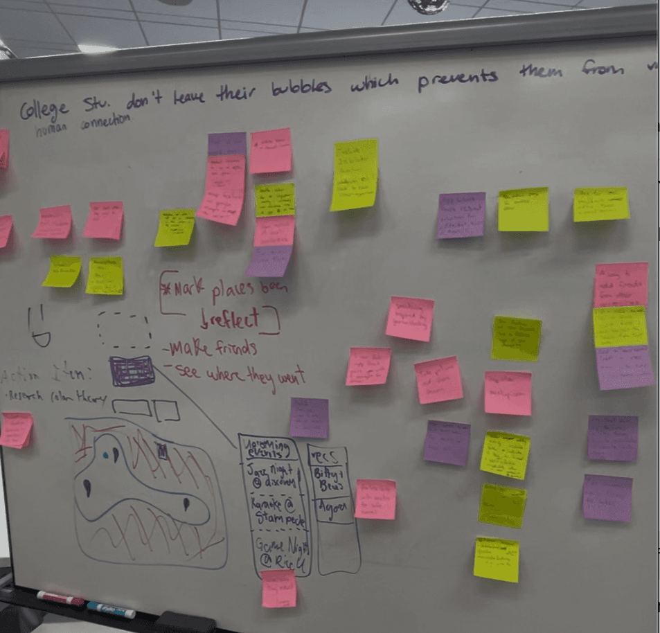
[Visual: Process snapshot — research notes, early flow, first prototype screens.]
Rapid research
Pressure-testing the idea with students
Because the sprint was short, our research had to be lightweight. The team split up and returned with a combined total of 50+ students on campus through informal interviews, quick conversations, and feedback from friends and peers.
We were not trying to claim statistical certainty. We were trying to quickly understand whether our direction resonated and what kind of social friction students actually felt.
The conversations helped us focus on a few patterns:
Students wanted more meaningful interaction than small talk
Shared activities made conversation easier
Many students wanted to explore more but needed a small push
To stay human in the age of AI, the experience had to move people away from passive consumption and toward doing something in the real world.
[Visual: Research callout card — “50+ students spoken to during the sprint.” Pair this with your survey/interview question screenshot if you have one.]
Defining the product direction
From “better conversation” to “better experiences”
At first, we talked broadly about helping students have richer social interactions. But the more we discussed it, the more we realized that conversation itself was not the only problem.
Students often struggle to connect because they do not have many shared experiences, as many come from different backgrounds. Especially early in college, a lot of interactions stay surface-level because people are still building the stories, memories, and routines that make deeper conversations possible.
So we reframed the product around experience-building.
We named our design “Burst Your Bubble” that helps students:
Discover places and events near them
Visit those places in person
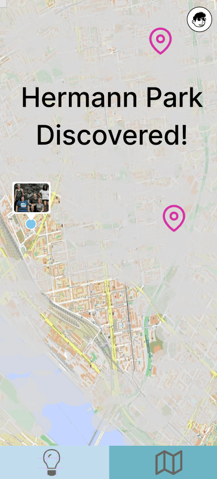
Log what they experienced
Use those memories as a starting point for real conversation
The app was not meant to replace social interaction. It was meant to give students more to talk about once they were face to face.
The defining feature
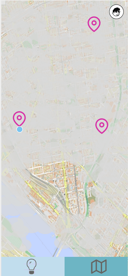
Fog Map
The feature I proposed was the Fog Map.
The idea was simple: unexplored parts of the user’s surrounding area are covered by haze. As students physically visit places or activities, those areas become visible. I was inspired by the video game Grand Theft Auto, where unexplored parts of the map gradually become visible as players move through the world. I wanted to adapt that feature to our design to encourage students to become more comfortable being adventurous in real life.
I liked this mechanic because it made the product feel playful without making the phone the final destination. The screen creates curiosity, but the reward happens offline. To “unlock” more of the map, users have to go somewhere, do something, and make a memory.
Moreover, it allows users to familiarize themselves with their surroundings at their own pace.
[Visual: Fog Map screen with haze and map pins.]
The prototype’s main map screen uses a hazy overlay with location pins and the line “expand your bubble to see the world,” reinforcing the idea that students reveal the world by exploring it.
Why it fit the prompt
A lot of technology tries to optimize connection by making interaction faster. We wanted the opposite. The Fog Map intentionally slowed the user down and created a reason to step outside their normal path.
The user could not fully experience the app by staying still. And this was the exact point we wanted to make!
Designing the flow
Balancing playful discovery with practical browsing
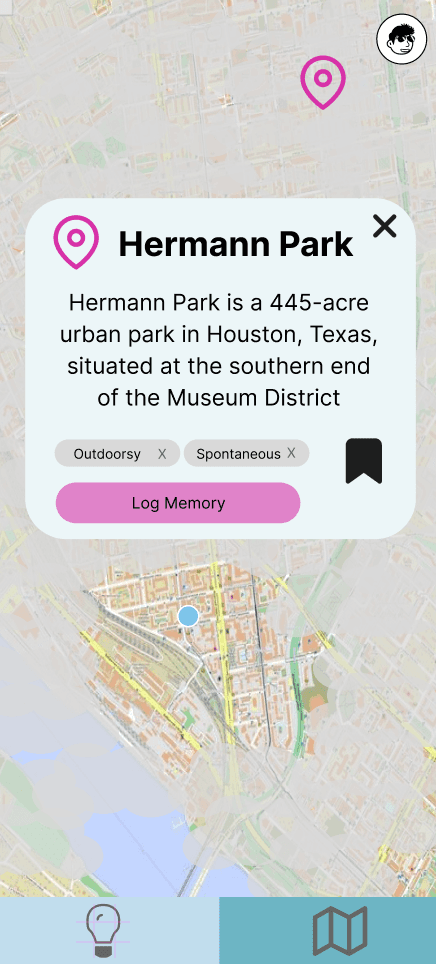
The Fog Map made the concept unique, but we also knew it could not be the only way to browse activities. Some students may want a more direct way to compare options by time, location, or interest. Although aesthetics was an important objective, we wanted to prioritize accessibility and inclusivity too.
The map created a sense of curiosity and discovery. The list view made the product more usable when someone already had a goal in mind.
[Visual: Map view → Nearby Places list → Upcoming Events list.]
Personalizing the experience
Onboarding without overcomplicating the product
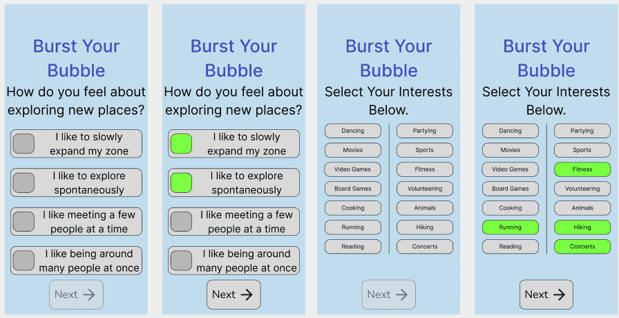
I also helped with the onboarding flow. Since the app was built around exploration, we needed a way to learn what kinds of experiences a student might actually want and what kind of ideal social settings they preferred.
The onboarding asked students how they felt about exploring new places and allowed them to select interests such as fitness, hiking, running, concerts, volunteering, sports, cooking, movies, and games.
This gave the app a way to recommend activities without making onboarding feel like a long personality test.
[Visual: Onboarding preference screen + interests screen.]
A key product decision
Cutting features that made the app feel too much like social media
Early in the sprint, we imagined a larger app with more sections, including friend-focused features. But as we built, we realized that some of those ideas worked against our original goal.
A friends page would have made Burst Your Bubble feel more like another social platform. It might have encouraged students to stay inside the app instead of using it as a prompt to go outside.
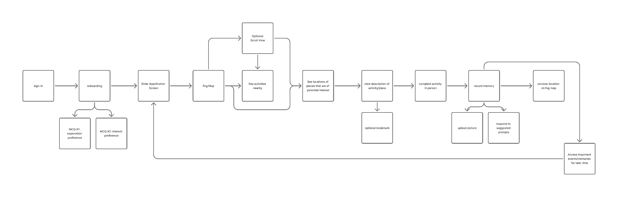
So we simplified the experience around one core loop:
Discover → Visit → Log → Remember
That decision made the product more focused. Instead of trying to become a full social network, Burst Your Bubble became a tool for creating the kinds of memories that make offline connection easier.
[Visual: Early navigation with removed sections crossed out, next to the final simplified flow.]
Outcome and Potential Future Work (Updated)
We submitted Burst Your Bubble to Rice Design-a-thon 2025 through Devpost. The public gallery describes the project as a way to “explore the world beyond campus and build genuine experiences,” which matches the final direction we landed on.
Our final product was only a mid-to-high fidelity prototype. However, looking forward, I hope to continue working on this idea and actually create a usable application that can be implemented around campuses across the US and even more. I think the overall concept we came up with was valuable, and I truly believe this can help incoming students interact with their peers more easily.
[Video/screen recording of prototype] – its already completed!
Reflection (Updated)
Learning design by doing
Looking back, the prototype is not as visually polished as my later work. Some screens are rough, and there are interactions I would rethink today. But that is also why this project matters to me.
It was my first time learning how much design happens before the final screen: defining the problem, deciding what not to build, translating research into a product direction, and making tradeoffs when time is limited.
The biggest lesson was that a strong designathon project does not need to solve everything. It needs a clear point of view.
For Burst Your Bubble, that point of view was:
Staying human in the age of AI is not just about using less technology. It is about designing technology that gives people a reason to go live more memorable lives.
With more time, I would test whether the Fog Map actually motivates students to explore new places, simplify the visual system, refine the memory-logging flow, and think more carefully about privacy around saved memories.